Plugin Information
| Version | 1.0.5 |
|---|---|
| Author | Dataiku |
| Released | 2016-06-28 |
| Last updated | 2025-02-10 |
| License | Apache Software License |
| Source code | Github |
| Reporting issues | Github |
With this plugin, you will be able to:
- Create a projected graph from a bipartite graph dataset
- Compute common graph features
- Run clustering graph algorithms
- Visualize graphs in custom charts
How To Use
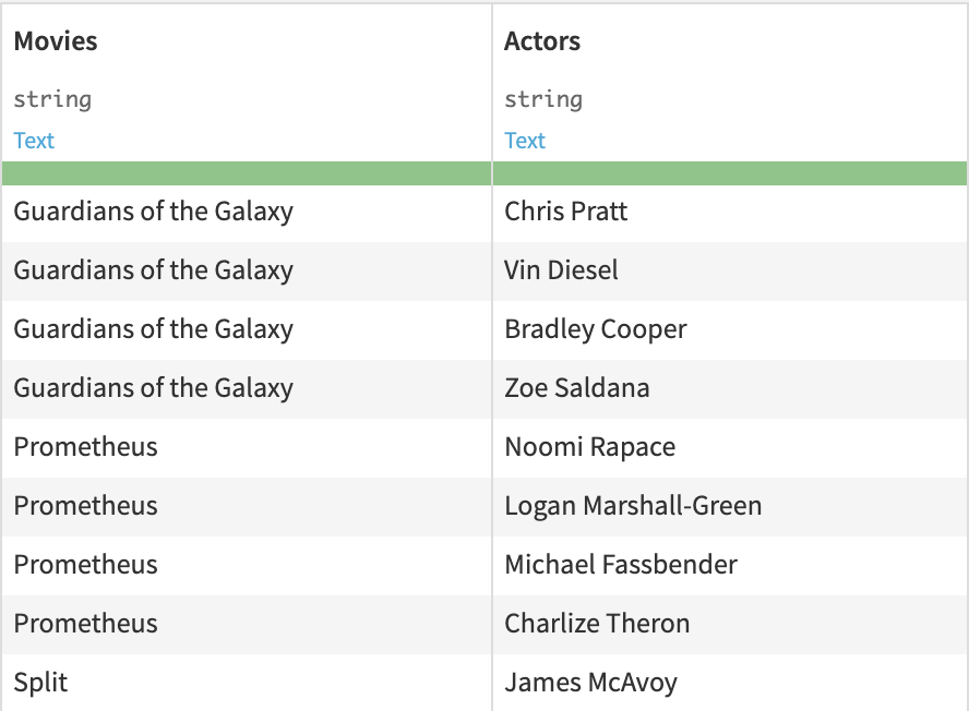
We will explain the different plugin components using a dataset of movies and their actors as example.
Using the Projected graph recipe, we will first convert this dataset into a graph dataset that contains pairs of actors that played in movies together.
We will use the Graph clustering recipe to assign actors to different clusters based on some selected graph clustering algorithms.
Then, the Graph features recipe will compute for each actor some common graph features such as pagerank, degree, eigenvector centrality, etc … .
Finally, we will be able to visualize the output of these recipes in a Graph chart in order to get some insights about the graph.
Here are the first rows of the Movies and Actors dataset:
Create a projected graph from a bipartite graph
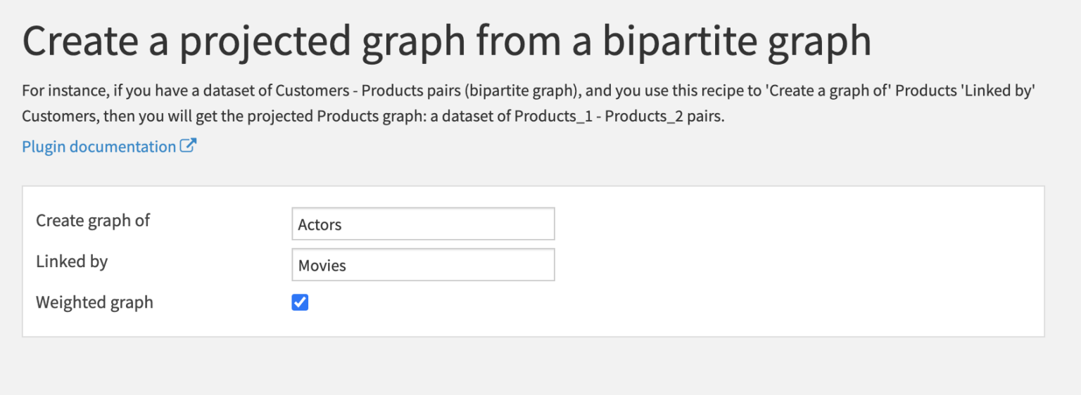
Using this recipe we can convert this dataset into a graph of actors. Two actors are connected if they played in the same movie.
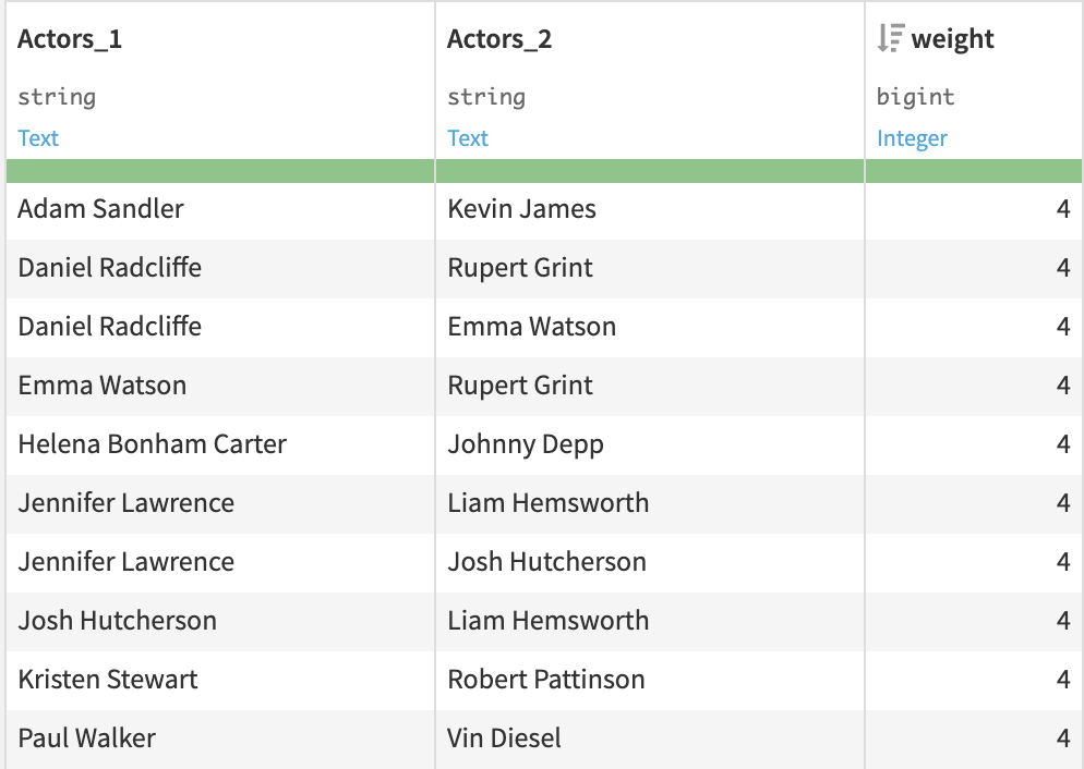
The output of this recipe is a dataset of pairs of actors. Because Weighted graph has been selected, the extra column weight is the number of movies in which the two actors played together.
Graph clustering
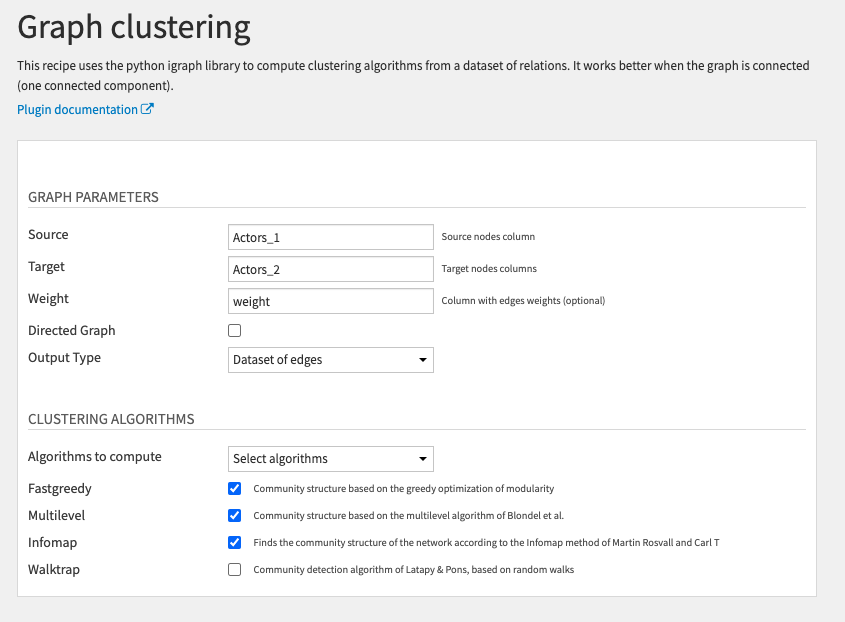
This recipe uses the iGraph library to compute clustering algorithms from a dataset of relations.
You need to select the Source and Target columns of your input dataset that are linked together (Actors_1 and Actors_2).
This will create edges between actors in the same row. Here the graph is not directed because the order between Source and Target is irrelevant.
We can select the weight column to create a weighted graph.
There are two options for the Output Type:
- Dataset of edges to keep the same dataset structure: one row per edge and additional columns with the features of both the source and target nodes.
- Dataset of nodes to only keep information about the nodes (the edges are lost): one row per node and its features.
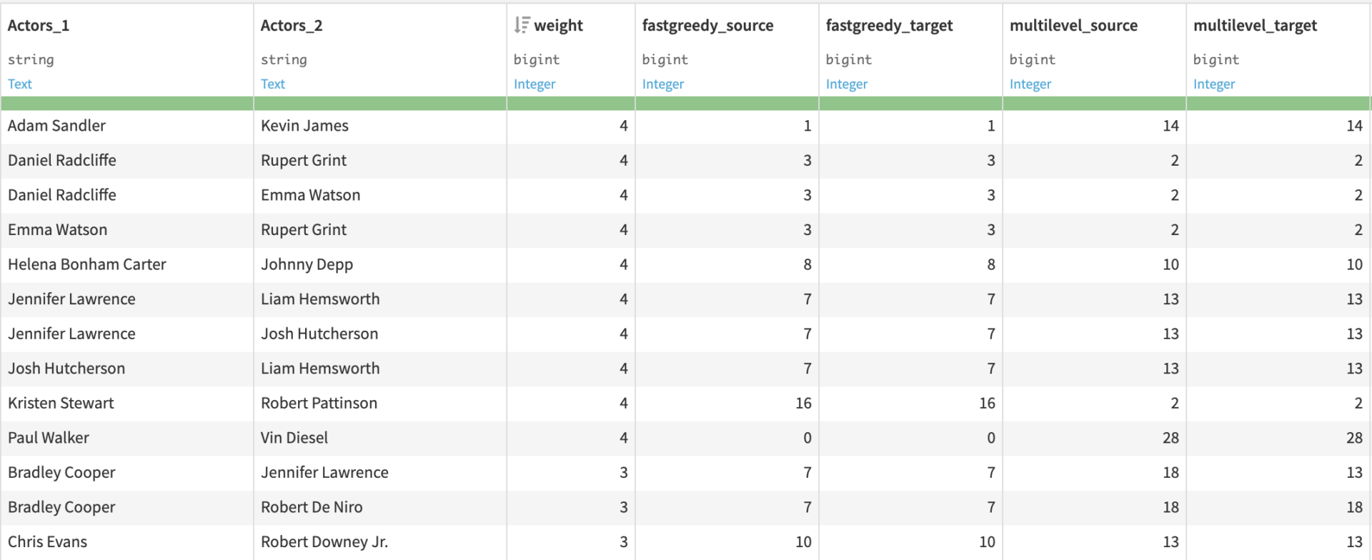
For each clustering algorithm selected, nodes are assigned their cluster id.
Each row contains the clustering values of both the source and target nodes (fastgreedy_source are the cluster values computed by the fastgreedy algorithm corresponding to the source column).
Graph features
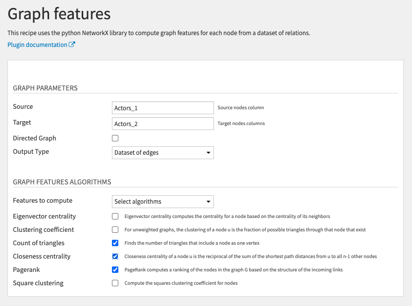
This recipe works exactly like the Graph clustering recipe but compute different types of graph features.
Graph chart
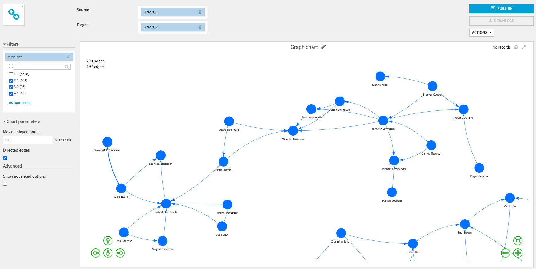
We can visualize the dataset as a graph using the custom chart of the plugin (in Charts > Other > Graph chart):
You need to drag and drop the Source and Target columns and select a maximum number of nodes to be displayed.
You can decide whether you want directed edges (edges with arrows).
You can also use the filters on the left (here we choose to display only edges with a weight higher than one):
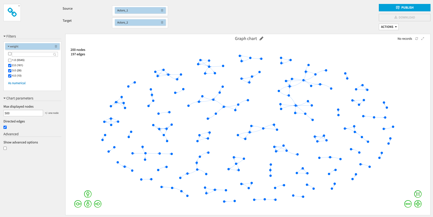
You can also zoom in to see more information about the nodes.
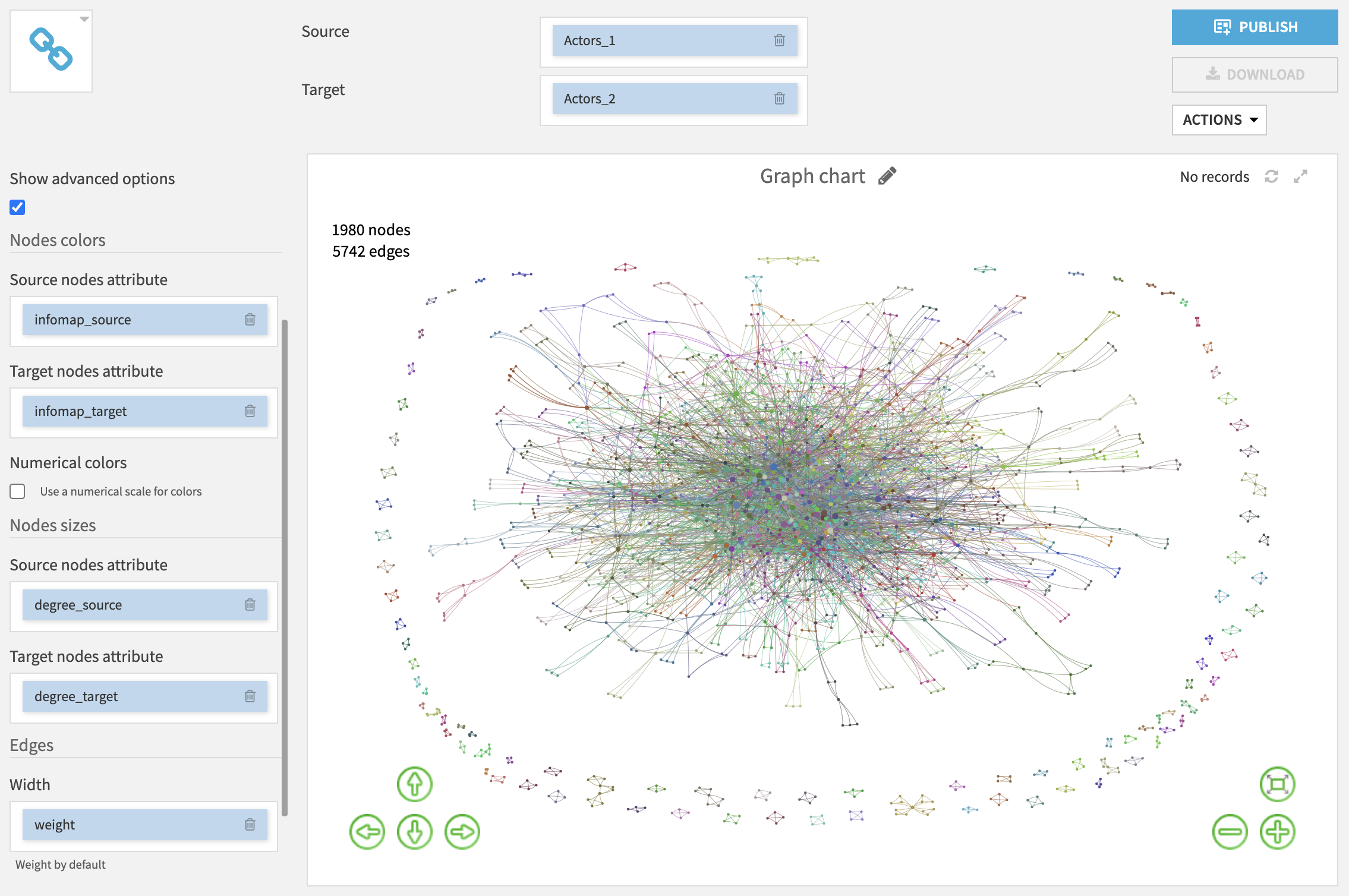
By selecting Show advanced options you will be able to customise the graph display (node color, node size, edge width).
For example, you can use the graph clustering values to set the nodes colors: nodes with the same values (in the same cluster) will have the same color.
You can also set the nodes sizes by selecting numerical columns: the higher the value, the bigger the node.
When you zoom in, you can see the nodes labels (and if you hover a node or an edge, it will display more information about the attributes used to set the color, size or width).
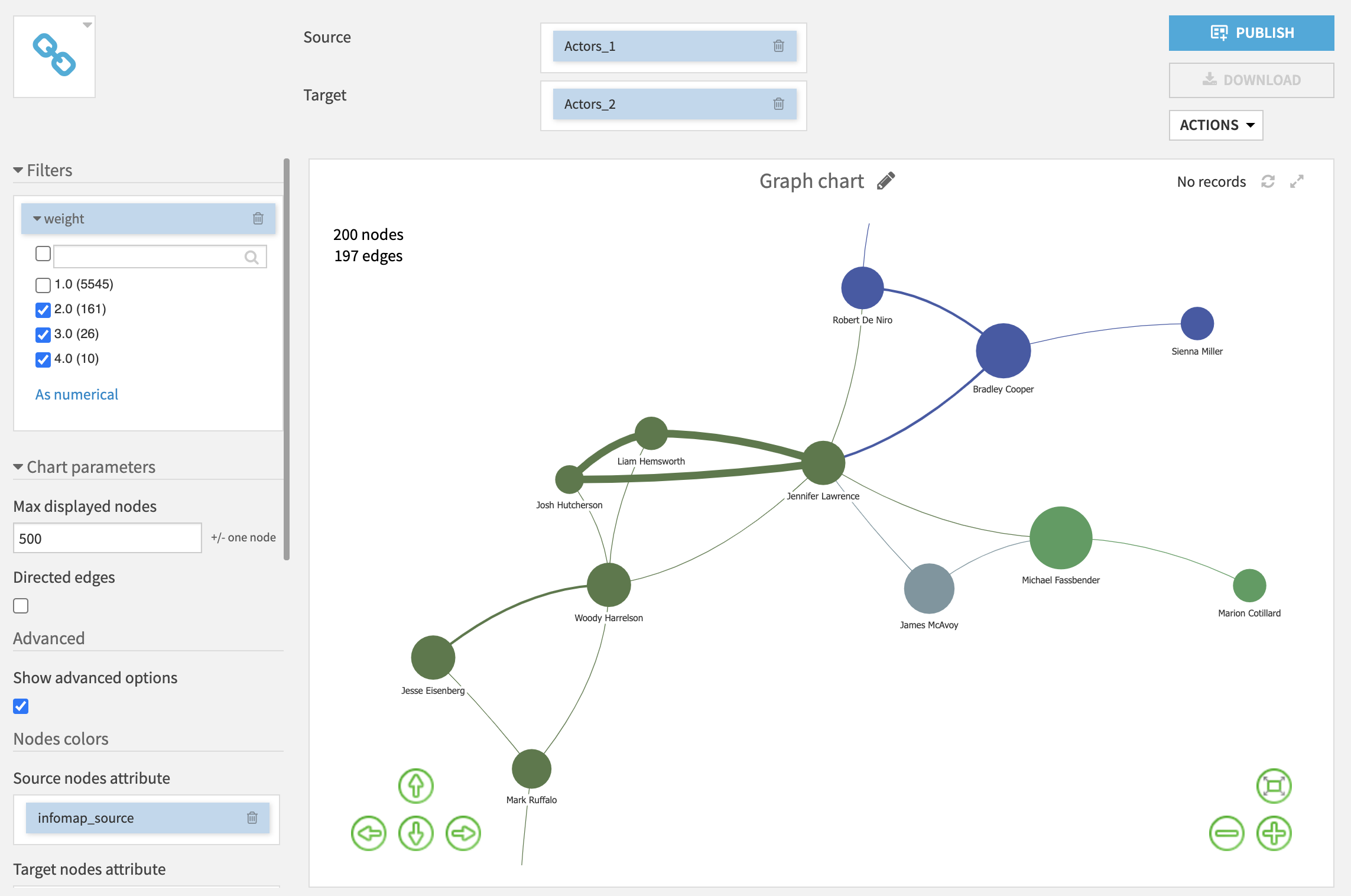
Finally, double clicking on a node will highlight only its neighbours.
It’s now your turn to customise your graph and share it in a dashboard to other users !
